This week it's all about Colour! and exploring the aspects of colour. (and this is a collection of work, in progress...I keep adding to it as i find things!)
Brief
The following exercises will explore your personal associations with colour, utilizing tone and saturation as a tool to manipulate the possible sensations evoked by colour.
What is a Tone>Hue>Shade>Tint>Value???
What does saturation refer to? Saturation is the strength of the pigment in the colour, usually thinning the colour to vary the strength e.g. watercolours - the intensity of the colour varies with the amount of water you use on the brush.
What is Tone and Why is it important in Painting?
Tone refers to how dark or light the colour is and using white or black to soften or deepen the tone gives the value of colours.
"On an instrument, you start from one tone. In painting you start from several. Thus you begin with black and divide up to white ..." - Paul Gauguin
Tone varies from the bright white of a light source through shades of gray to the deepest black shadows. How we perceive the tone of an object depends on its actual surface lightness or darkness, color and texture, the background and lighting.Helen South (About.com)
More good advice from About.com:
Read more about Colour Tones here:
What about the meaning or psychology of colour:
EXERCISE 1
Requirements:
• 4 x small primed support (primed paper/card or acrylic paper is fine).
• Variety of colours (oils or acrylics).
• Water or turpentine and mediums.
• Brushes.
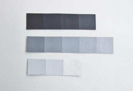
Paint each colour onto a small support. Look at the colour you have painted and write down the personal associations or sensations you relate to each of the five different colours.
not the best example of my swatches - will have some better photos up soon!
Color is the perceptual characteristic of light described by a color name. Specifically, color is light, and light is composed of many colors—those we see are the colors of the visual spectrum: red, orange, yellow, green, blue, and violet. Objects absorb certain wavelengths and reflect others back to the viewer. We perceive these wavelengths as color.
A color is described in three ways: by its name, how pure or desaturated it is, and its value or lightness. Although pink, crimson, and brick are all variations of the color red, each hue is distinct and differentiated by its chroma, saturation, intensity, and value.
Chroma, intensity, saturation and luminance/value are inter-related terms and have to do with the description of a color.
Chroma: How pure a hue is in relation to gray
Saturation: The degree of purity of a hue.
Intensity: The brightness or dullness of a hue. One may lower the intensity by adding white or black.
Luminance / Value: A measure of the amount of light reflected from a hue. Those hues with a high content of white have a higher luminance or value.
Shade and tint are terms that refer to a variation of a hue.
Shade: A hue produced by the addition of black.
Tint: A hue produced by the addition of white.
...starting to collect my thoughts on colour associations:
RED: represents fire, passion, heat, excitement, increased energy and confidence...and of course Love :o)
Advertising associated with Red: Red Cross, Coca Cola, Red Bull (energy drink)
PURPLE (and PINK): is related to the Heart Chakra and represents peace, devotion, harmony and balance, pure love and protection, comfort, royalty, mystery and magic. Purple is made by mixing equal amounts of red and blue, a combination of warm and cool, and is a very balanced colour to use.
Word associations: soft, velvet, smooth
The most famous association with purple and the heart is the award known as the 'Purple Heart' given to soldiers in recognition of merit, and dates back to the early days of the American Revoloution.
Advertising associated with Purple: mainly chocolate! Cadbury's Dairy Milk,
and Kraft's Milka chocolate.
ORANGE: can relate to the Swadisthana Chakra and is made up of red and yellow - the fire and the sun, representing energy and power and FRESH!
Advertising associated with Orange: Orange juice
GREEN: relates to the Nabhi Chakra and denotes peace, satisfaction, contentment and generosity.
Advertising associated with Green: Eco products, energy saving products.
EXERCISE 2
Requirements:
• 4 x A4 primed support (primed paper/card or acrylic paper is fine).
• Variety of colours (oils or acrylics).
• Water or turpentine and mediums.
• Brushes.
You will now have four supports painted a different colour. For this exercise you will need to create studies that incorporate each selected colour and:
1. another colour that is the SAME tone;
2. the same colour but at different tonal values;
3. and alter the saturation of the original colour.
More info on Colour from Jeremy Sutton and Tim ONeill - Digital Paint Magazine Blog
ACTIVITIES:
Week 7 Online Blackboard Activity
What associations did you have to different colours? [SEE ABOVE]
In the VSW14 discussion board, discuss areas of interest regarding colour philosophy and associations for different cultures and areas in society.
EMOTIONS AND FEELINGS ASSOCIATED WITH COLORS
Warm Colors
Warm colors “pull forward” more than cool colors.
In this way, a dark version of a warm color will appear
to be the same brightness as a mathematically lighter
version of a cool color. Red
Energy, Power, Passion, Love
Orange
- Happiness, Enthusiasm, Attraction, Success
Yellow
- Cheerfulness, Stimulation, Attention-seeking,
Cool Colors
Cool colors “push backward” or recede more than warm colors. In this way, a light version of a cool color will appear to be the same brightness as a mathematically darker version of a warm color.
Green
- Refreshing, fresh, prestige, cooling, calming,
Blue
- reliable, trustworthy, dependable, restful
Purple
- spirituality, ceremony, mystery, transformation, royalty
Color Neutrals
Color neutrals have a less emotional impact and are therefore considered for more objective presentation. However, used well, color neutrals can have their implications. “Pure” black and “pure” white are our ideal “bright” and “dark” colors on the spectrum, respectively.
Black
- Sexy, mystery, submission, danger
White
- Purity, innocent, refreshing, neutral, sterility
Record your online activity in your visual diary.


![[howard+hodgkin.bmp]](https://blogger.googleusercontent.com/img/b/R29vZ2xl/AVvXsEjz6WAmw2rplDUk-2I70f3ao7xtwdDUlbZ1bVHHAaBFs3RF0fMSX8dItxysQcV_TOS914Cf3zbw0jnjy0ZptiJosM1rosyEjK8b7EhK7zgHdfpojNDDaVQuhFCastlQX83oSbZq1rxaW74/s400/howard+hodgkin.bmp)


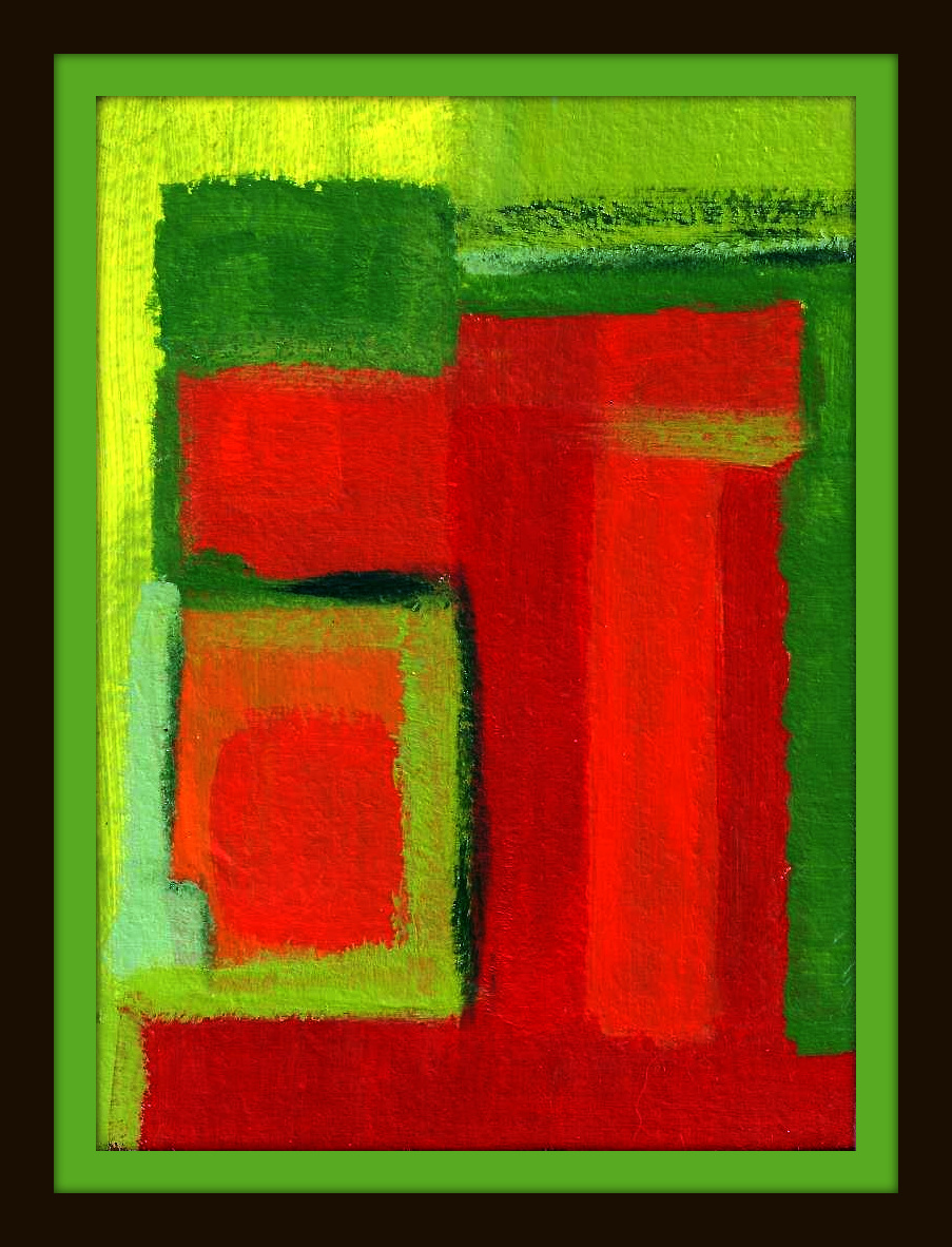
 Ian Davenport, Puddle Painting: Magenta,