04 June 2011

FINISHED!!!!!!!!!!!

Just handed in my last project for VSW14 - such a stress!!! Now all i have to do is wait and see how i went.

i need to debrief on this one, as there were so many obstacles to my succeeding that it nearly tipped me right over the edge....but right now i am too tired, exhausted and drained. be back soon to elaborate :o)

also had to go to the opening of a local exhibition tonight where we had some of our work on display.

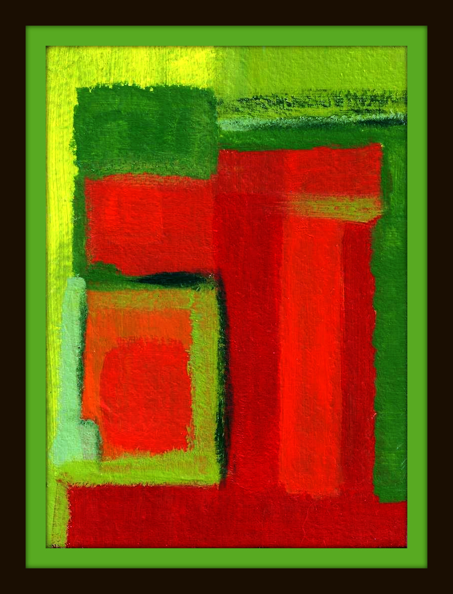
Franz Baumgartner, 2011, Challenges Strengthen Our Faith

Susi Baumgartner, 2011, My Mentor


16 May 2011

Quotes on Being an Artist


It is not enough to know an artist's works. One must also know when he did them, why, how, in what circumstances ... I attempt to leave as complete a documentation as possible for posterity. ” – Pablo Ruiz Picasso


Sketching and Planning is always a good thing...


sketches and drawings from Edward Hopper
© Edward Hopper 1959. Whitney Museum of Art. New York


[howard+hodgkin.bmp]

PROJECT 8: TRANSFORMATION & DEVELOPMENT

Things to consider
Ensure you think creatively and with imagination. Utilize all that you have learnt from the previous exercises in this unit from mark making and exploring the physicality of paint, to creating temperature with colour.
Summary of Artists to Research
Edward Hopper, Rover Thomas, Alberti Giocometti, Lucio Fontana, Ross Blechner, Kathleen Petyarre, Leonardo da Vinci, William Turner, Casper David Friedrich
AND
Damien Loeb http://www.damianloeb.com/
Marc Chagall http://www.chagallpaintings.org/
Eric Fischel http://www.ericfischl.com/
Luc Tymans http://www.artcyclopedia.com/artists/tuymans_luc.html
Spend some time researching a few of the above listed artists as well reading the following articles which focus on two different artists approach to working with space and painting.

Web-based Research
Helen Frankenthaler: http://www.stfrancis.edu/en/student/beatart/frank.htm
Mark Rothko: http://www.nga.gov/feature/rothko/rothkosplash.html

Shared Art Files>Art Image Database>VSW14
Howard Hodgkins

Clarice Beckett
Francis Bacon
Paula Rego
R.B. Kitaj

 Edward Hopper


07 May 2011

PROJECT 7: COLOUR, TONE & TEMPERATURE

Brief
The following exercises will introduce you to the way tone and colour combinations can create a temperature within a painting. Look at the following images in your image gallery to see how various artists have employed this to convey a strong dynamic and temperature within their work. Take some time to read the article on Luc Tuymans and consider how he uses colour and image construction to create a mood and sensation in his paintings.


Reader
Archer, M., Luc Tuymans: Behind The Mask.

-Blackboard Learning Resource
Shared Art Files>Art Image Database>VSW14
EXERCISE 1
Requirements
• Full range of oils or acrylic paints.
• Water or turpentine.
• Palette (large & preferably white) that allows plenty of room for colour mixing.
• 1 primed support, A4 or A3 size (primed ply board, masonite or acrylic paper).
• Decent brushes (the more you have the better) and rags.
• A simple image, model or object. If you have trouble isolating different tones choose something that has a limited tonal range.

For this exercise you need to use a divisionist technique (of small separate marks), to paint the object in monochrome.

Things to consider
1. You should paint a monochrome painting first and then apply the colour to it.
2. To make this exercise easier use the tonal scale you made earlier as a guide.
EXERCISE 2
Requirements
• Oil or Acrylic paint – warm and cool red, warm and cool blue, warm and cool yellow.
• Palette knife.
• Palette.
• Rags.
• Water or turpentine.
• Jars.
• 1 primed support, A4 or A3 size (primed ply board, masonite or acrylic paper).
• The simple image, model or object from Exercise One.
The following exercise will familiarize you with potential tones and temperatures whilst using complimentary colours. If you are working from a model or object place the selected item on a plain sheet of paper. Ensure that whatever is behind your model to form the background is simple.

Web-based Research
Before commencing this exercise revisit the traditional colour wheel which can be found at this website under “colour wheel”
* http://www.worqx.com/color/

EXERCISE 3
Requirements
• Oil or Acrylic paint – warm and cool red, warm and cool blue, warm and cool yellow.
• Palette knife.
• Palette.
• Rags.
• Water or turpentine.
• Jars.
• Selection of brushes.
• 1 primed support, A4 or A3 size (primed ply board, Masonite or acrylic paper).
• The simple image, model or object from Exercise One.
Again this exercise will familiarise you with potential colour variations and temperature whilst using complimentary colours. Once again, if you are working from a model or object place the selected item on a plain sheet of paper. Ensure that whatever is behind your model to form the background is simple.
Choose a primary colour and a complimentary opposite colour for this exercise.
Week 9 Online Blackboard Activity
Post images and discuss your learning experiences from Project 7 on the VSW14 discussion board.
Record your online activity in your visual diary.

PROJECT 6: COLOUR RELATIONSHIPS

READ: 


Brief
The following exercises will allow you to observe the interdependency between quantity and quality of colour. This will also be taken into the context of your every day environment.

Summary of Artists
There is an enormous range of artists who focus on colour and colour relationships as a part of their painting practice.
Listed are a few for you to research:
Gabrielle Evertz,
Katherina Grosse,
Karin Sander,
Torie Begg,
Beatriz Milhazes,
Franz Ackermann and
Ugo Rondinone.

Before commencing the following exercises have a look at the following articles that look at technical applications to colour and the application of colour within space.

Web-based Research
Reader

-Blackboard Learning Resource
Shared Art Files>Art Image Database>VSW14
  • Adrian Schiess
Puddle Painting: Magenta,Ian DavenportIan Davenport, Puddle Painting: Magenta, 
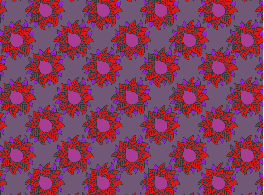
2009, acrylic paint on stainless steel, mounted on aluminum panel , 98 1/2 x 98 1/2 inches 250.2 x 250.2 cm
© Ian Davenport


EXERCISE 1
Requirements
• Variety of colours (acrylics).
• Water.
• Brushes.
• Palette (large and preferably white) that allows plenty of room for colour mixing.
The focus of this exercise is to work within your own environment to create a new tension ordynamic using colour. First you need to select an area from your immediate surroundings. It may be a corner of a room, part of a wall, a garden gate, the ceiling or part of a door-frame. In your selected space choose a colour that you will paint into that area to give it a new visual dynamic.
Document your work once you have completed this colour intervention.
Things to consider
1. Before commencing, consider what effect you want your added colour to achieve within this space. Think creatively.
2. Do you want this colour to work in a way that compliments the surrounds or will add contrast?
3. Will you add a subtle tonal shift or juxtapose complimentary colours?
4. If you are unable to work directly onto a surface in your immediate environment consider working with a support that can be placed within the area you are interested in.
5. You are not making a painting for the wall; the space/wall or other surface is the painting so to speak.
6. This exercise is not about painting a mural, try not to become figurative in your approach to this exercise.